The design of our website is being changed almost continously. I am always trying to improve its conversion power, by making small optimizations to the layout, the design and the copy.
But this time I am implementing a more radical change: a completely new layout. In the next couple of weeks I will be testing the new layout vs the old layout using an A/B split test. That is, fifty percent of new visitors will be seeing the old layout, the other fifty percent will get the new layout. Then we’ll be measuring sign-ups, downloads, sales and profits in both groups.
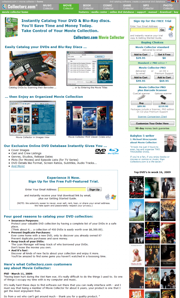
Version A: the “old” design
Here’s a screenshot of the old Movie Collector product page:

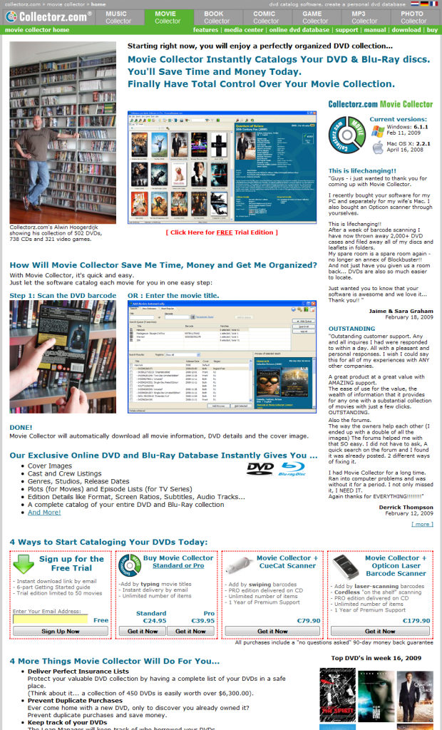
Version B: the new design
The goals I had for the new layout and design:
- Get rid of the noisy and crowded download/buy panel on the top-right.
- More focus on the result of cataloging your collection, as opposed to the process itself. In other words: promote benefits, not features.
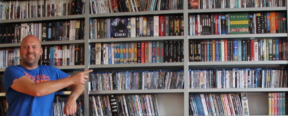
- Replace the box-shot in the top left with something more interesting, preferably a photo of a person.
- Add more recency / up-to-dateness.
- Make better use of user testimonials.
After a couple of days, this is what we arrived at:

And the winner is ….
Today I have started the A/B test. I am planning to let it run for 14 days. Unless the results after one week are dramatic (one way or the other).
What do you think? Which one will win? And by how much?

You change many factors at once here… One major difference is the Buy Now boxes being above/below the ‘fold’. Wouldn’t it be better to change one thing at a time? My bet is version #2, because it has more personality. But your visitors will have a hard time finding the Buy button on #2…
Yes, I am changing lots of stuff in one go. Sometimes that is the only way to do it. In this case the changes belong together, so it wouldn’t be possible to test them one by one.
I mean, giving the testimonials this prominent screen estate wouldn’t have been possible without moving the buy boxes down.
Another reason to do more changes at once is to make them more measurable. The effect of some of the changes I made here would be negligible when tested on their own.
I agree that it is harder to find the Buy buttons now. In fact, I think that is the biggest risk I am taking here.
I think the new version is more likely to keep visitors on the page longer. The four main pictures on version 1 aren’t that interesting, and give the visitor enough information in a few seconds to leave early. Version 2, makes you think “who’s this guy with the bookcase” and they have to read the text to find out. The text establishes you as a collector of DVDs and games etc, like them, so I would think they are willing to spend more time on the page to find what you have to say. I’ve just started looking at bounce rates for my site, and 80% of visitors leave within 10 seconds. As my program lists Windows files, I don’t think I could have a picture of me with my 250,000 files, so I’ll have to think of other ways to keep their interest.