 Once in a while, I try to take a “fresh” look at my website. I just put one of our product pages on my screen, I sit back and try to imagine what it looks like for a new visitor, who just arrived there after a Google Search.
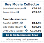
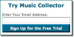
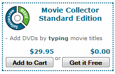
The last time I did this, the main thing that struck me was all the Try/Buy “noise” on the right side of the screen. There’s a Sign Up for the Free Trial box, a Get it Free (TrialPay) option and five (!) different buying options (Standard, Pro, two “Pro + scanner” options, plus a “custom order” option). I realized that I had been replicating most of my shop page right there on the landing page.
So I started experimenting with a different approach, aimed at getting more people to sign up for the free trial. Then just let the trial edition and the autoresponder sequence do the conversion to sales. I didn’t want to remove all buying options though, because we see a lot of customers buying without trying. But it would have to be reduced to just one button, simply taking the user to our recently re-designed shop page. Continue reading →
 Last week, Dan McGrady reported how he improved his conversion rate by 72%. One of the things he did was changing his signup button from green to red. This alone gave him a 21% increase in conversion.
 Delivery on CD and Priority Support options, do you offer those up-sells “opt-in” or “opt-out”? In other words, when users click your Buy button, do you put these extras in their shopping cart automatically?
  Once in a while, I try to take a “fresh” look at my website. I just put one of our product pages on my screen, I sit back and try to imagine what it looks like for a new visitor, who just arrived there after a Google Search.

