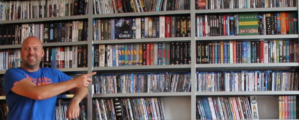
The loss of the testimonials on the top right of our new website design kept nagging me. So I discussed it with Mark, one of our web developers. And he came up with an idea to create a nice spot on the top right for one hot testimonial:
- We decreased the height of the photo of the bald guy in the top left
- Now we could move the headline over to the left
- Which created some space top right, just enough for one testimonial (or at least part of it)
We also centered the headline above the first two pictures, which seems to make it stand out a bit more.
Here’s the result:

