 My new product Manula will go live within a couple of weeks. We’re currently aiming to launch before the end of this month. Just a few weeks left!
A quick recap of what it is: Manula is a web-app for creating online manuals. It lets you create, maintain and publish your manuals online. On top of that, it comes with built-in statistics tools that help you track the usage of your manuals so that you can easily spot which topics need improving.
In an earlier blog post, I have already told the story of how I got into the business of creating a manual tool. In short: I looked for a tool like this for the Collectorz.com manuals, couldn’t find one and decided to create it in-house.
Manula is basically version 2.0 of that in-house tool, rewritten from scratch.
So, knowing the history of the tool, who do you think is Manula’s first “customer”?
Yep, of course Collectorz.com is the first user. We have been using Manula ourselves since September 2012, for actual real life manuals. We’ve been tweaking the look of the manuals since then and today I am confident enough to show you the first screen shots of a manual created with my new toy.
The manual of our CLZ Movies app for iOS
One of the key features of the manuals created with Manula is their “responsive design”. Meaning that the look and layout of the manuals automatically adapt to the screen size of the reader. Manula manuals automatically look great on desktops, tablets and mobile devices.
So when looking for a good product to try Manula, the obvious choice was one of our iOS app, as their manuals have to work well on iPhone, iPad and on desktop computers.
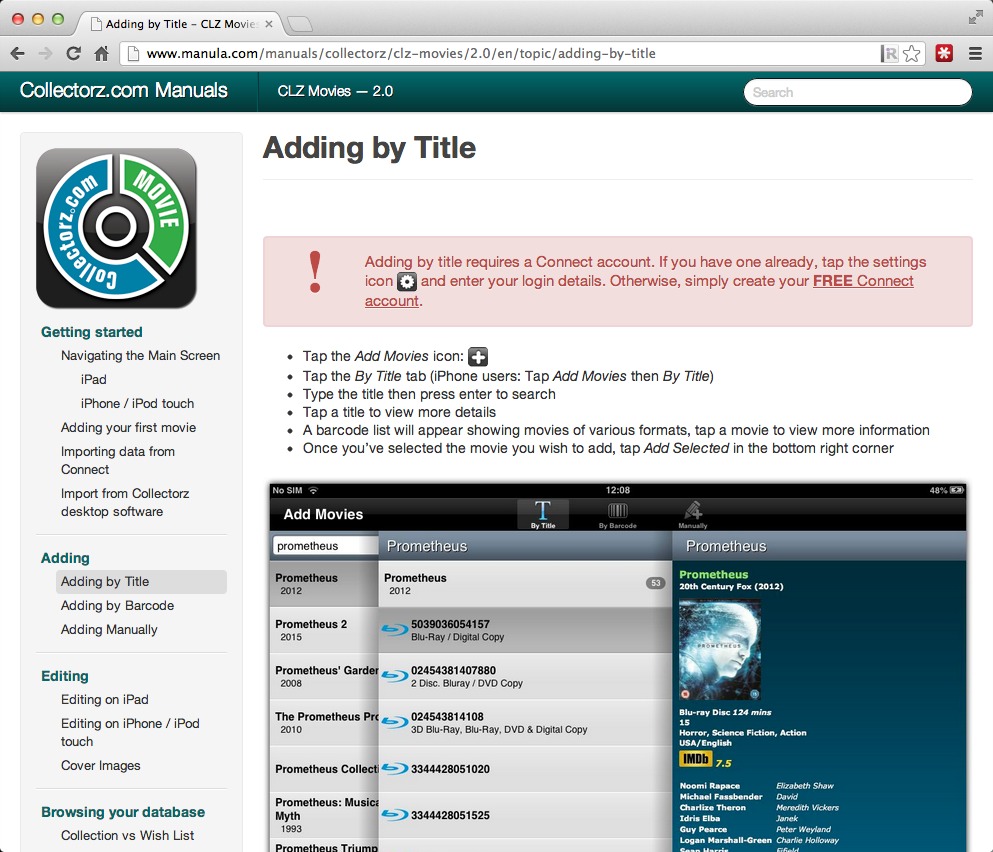
Here’s some screenshots of our CLZ Movies manual on different screen sizes:
CLZ Movies manual on desktop
On desktop browsers, the manual takes the full width of your browser. It automatically resizes both the TOC and contents panels to fit your width. If you size your browser to a width that is too narrow to fit the TOC panel, it automatically disappears and hides “behind” a Browse button in the header. Also, all images automatically resize to nicely fit the width of the contents area.
TIP: try it on the live CLZ Movies manual here. After opening the manual, try playing around with the width of your browser window and see how the manual automatically adapts.
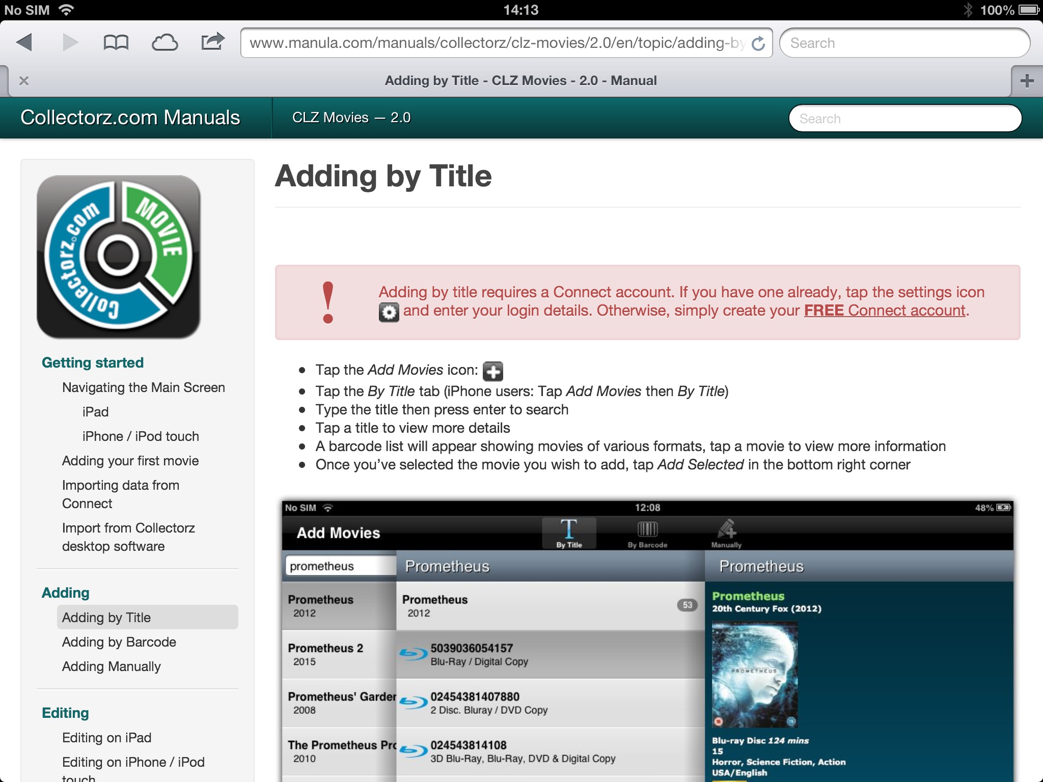
CLZ Movies manual on iPad
Landscape mode
On an iPad in landscape mode, the TOC panel fits nicely on the left of the content:
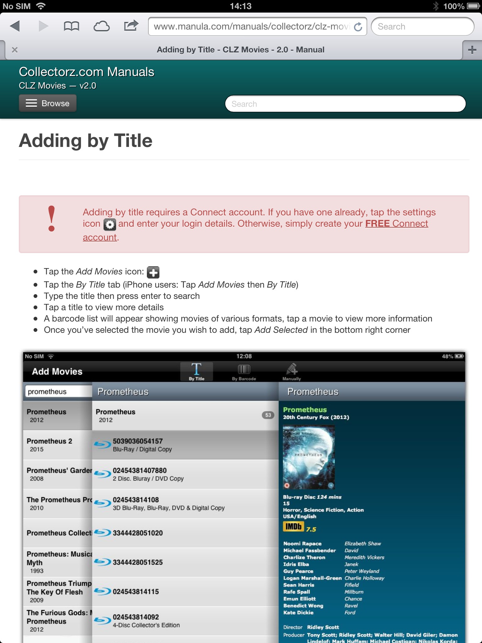
Portrait mode
With the iPad in Portrait mode, the TOC doesn’t fit and can be popped up from the Browse button in the header. The full width of the iPad screen is used for comfortable reading of the manual content.
CLZ Movies manual on iPhone
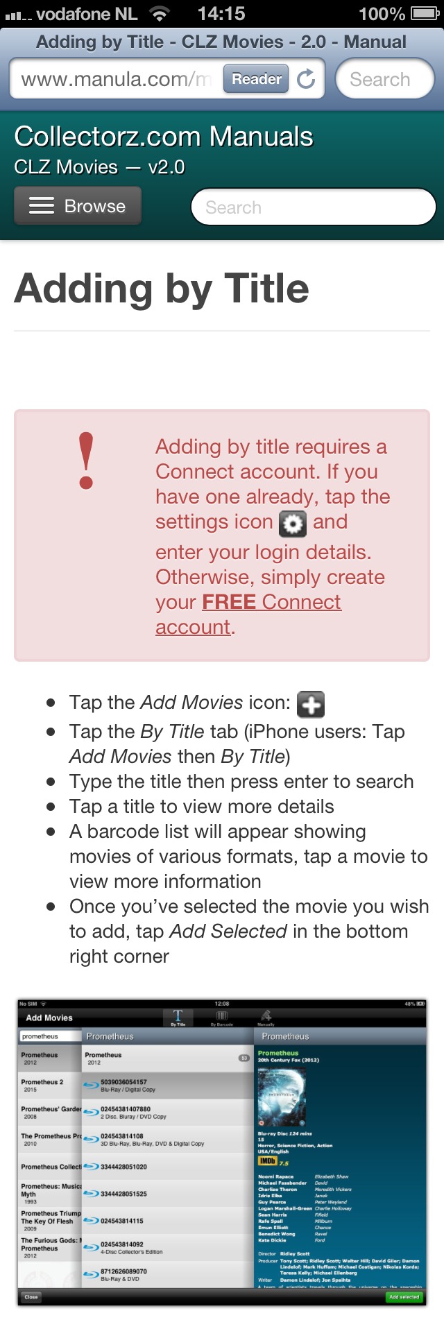
On iPhone, the TOC is always hidden behind the Browse button. The content adapts to the narrow screen.
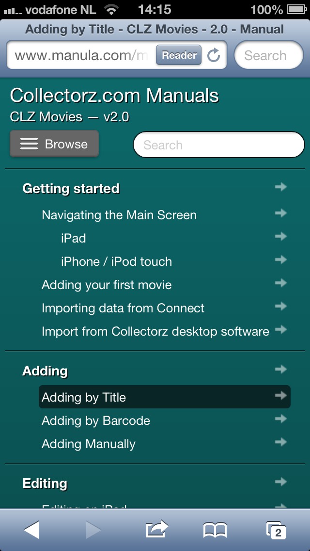
Here’s how the TOC looks when opened from the Browse button.
In my next blog post: screenshots of the Manula web application itself, that is, the admin tool for creating and maintaining your online manuals.
