An A/B split test I did in April this year showed that for my Collectorz.com landing pages, photos of real people worked better than cartoons. So the completely new site design I created in June features large header images showing either me or my wife standing in front of our movie and book collections, like this:
 But a comment by Gleb Koshuiko on this blog (“Try to smile on the photo”) and one by a fan of our Collectorz.com Facebook page (“that is one angry dude”) made me think:
What would happen if the landing page had a smiling Alwin instead?
Or, let’s take this one step further, would it help if the person in the picture smiled and pointed to the main call-to-action, the free trial box?
So that is the test I just completed: Serious vs Smiling vs Pointing.
The Test
Here’s the three images I tested against each other. One control image (“Version A: Serious”) and two challenger images (“Version B: Smiling” and “Version C: Pointing”).
Header Image A, Serious Alwin:

Header Image B, Smiling Alwin:

Header Image C, Pointing Alwin:

Since the above picture is only shown on the home page and 3 of my product pages (Music, Movie and Game Collector), I am only tracking visitors that land on one of these pages. (the other product pages show a picture of my wife and her book collection).
On top of that, this is an A/B/C split test with traffic split over three options instead of two, so a longer than usual test period is needed. I was planning to run it for 2 or 3 weeks, but I got caught up with some other issues, so in the end the test ran for a full 5 weeks.
Wich turned out to provide some interesting insights…
The Results
These are the results of my A/B/C split test after 5 weeks of testing:
Version B compared to Version A
|
Version C compared to Version A
|
And yes, smiling works! Both challenger images, Smiling and Pointing+Smiling, do significantly better than the Serious image.
Looking at the bottom line (the profits), the one without the pointing is best, even though the pointing image generated slightly more sign-ups and a higher average purchase value.
So obviously, I have now switched my site over to show the Version B header image.
But wait, that’s not all!
The above “Results after 5 weeks” table is just that, a snapshot of the results after 5 weeks. But while peeking as the result unfolded during these 5 weeks, I noticed some interesting trends (yes, I admit, I am a peeker…).
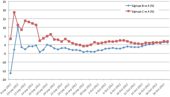
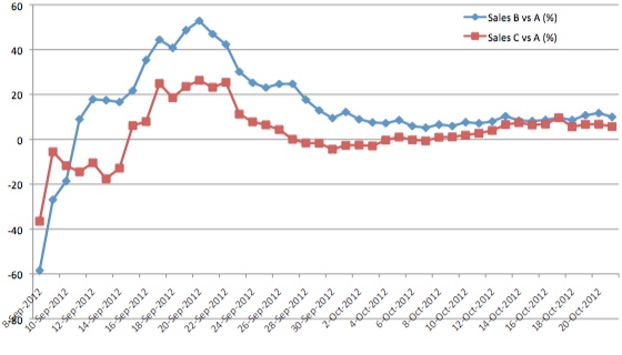
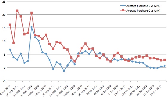
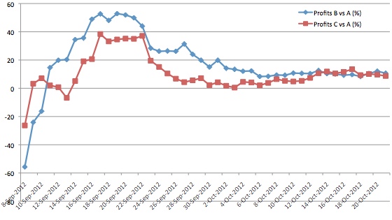
Take a look at these 4 charts showing the development of the 4 test variables over time. Note that the daily values shown are the cumulative values since the beginning of the test, not the values for that one day. This way we can see the values converge to a, hopefully, stable value over time.
Sign-ups for B and C relative to A (%)

Note that version C has been generating significantly more sign-ups than B over the entire period, only to end up almost at the same level.
Sales for B and C relative to A (%)

A similar trend can be seen in the sales chart, but the other way around. Version B has been performing much better than C for a long time, but the difference between B and C got smaller as time passed.
On top of that, for both B and B the improvement over A got smaller and smaller, going from a 50% improvement (after about 2 weeks) to the final 10% improvement after 5 weeks.
Average Purchase Value for B and C relative to A (%)

The same effect can be seem here. After about 2 weeks, C was generating 10% higher purchases than A, but after 5 weeks the improvement was just 3%.
Profits for B and C relative to A (%)

This is the most important one, the profits. Which is basically a combination of the Sales and Average Purchase charts.
Looking at the profit differences over time, it makes it even clearer that Version B must be the winner of this test, because it has been ahead all along.
So what information do these charts provide that a simple results snapshot doesn’t?
- See when results have stabilized:
A chart of results over time makes it easier to spot when the results have converged to a stable value. Which helps with the decision when to stop your test. Because of the higher volumes, Sign Up results are converging to a stable level much faster than Sales results. - Delayed conversions cause decreasing test effects
For both Sales and Purchase Value, the performance difference between the challenger and the control versions becomes smaller over time. I have seen this effect before, especially with landing page tests. Here’s my theory on why this happens:
I think this is related to “impulse purchases” vs “delayed conversions”. People buying on impulse are more likely to be triggered or influenced by the design of your landing page, causing big effects immediately after starting the test.
However, people who are more serious, the ones really taking your trial for a test drive for a couple of weeks, those people are less likely to be influenced by a different header image or button color. They either convert or they don’t. Which stabilizes and decreases the difference after a few weeks (depending on how long your average “incubation period” is).Note that this effect is not present in the Sign Ups chart. Sign Ups tend to be immediate, without delay. So the results just converge, but don’t decrease.
Personally, I am happy that circumstances forced me to run this test for a longer period.
I am amazed by the extra insights I gained from these charts. I mean, I could have stopped the test after 2 weeks, concluding I had reached a 50% performance improvement!

A bit like an A/B/B test. The idea is you run with three options but two of them point to the same page. Once the results of the two B pages converge you know the outcome is valid.
Great news Alwin! I’m so excited for your results!
So logical next step will be to try different clothes (maybe colors) and *drum roll* to shave 🙂
Also, you vs your wife will be interesting 🙂
The pointing photo is pure unadulterated cheese