 My new site design is finally performing better than the old design! But it took some tweaking and of course A/B split testing to get there.
Interestingly, the key changes were all related to the presentation and location of my main calls-to-action: try and buy.
Here’s an overview of the new design, the tweaks, the split tests and the test results.
The new design
Here’s the old vs the new design:
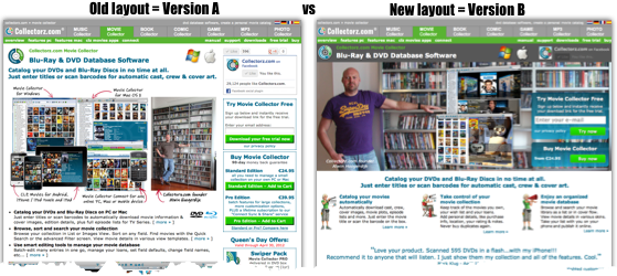
The main changes:
- 3 column content layout instead of 1 column content with narrow sidepanel.
- Dark grey header with product name, headline, platform logos and Facebook box.
- New site-wide picture at the top, with my two main call-to-action boxes (try and buy).
- 3 column content layout instead of 1 column content with narrow sidepanel.
The results after one week of A/B testing:
- Sign Ups: 1.0% more
- Sales: 17.1% less
- Average Purchase: 3.0% higher
- Total Profits: 14.8% less
Obviously, a 15% decrease in profits is not a good result. But my main disappointment was with the low (1%) increase in trial sign-ups. I was expecting more from the strong focus on the calls-to-action in the top section.
Tweaking the new layout
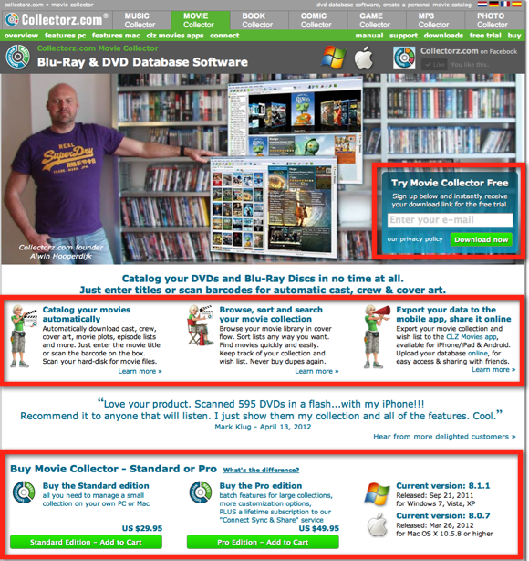
Based on the results of the first split test, I made some changes:
- Just one call-to-action (sign-up for the trial) in the top section.
- To make up for the loss of the buy box at the top, I moved the buy boxes in the content up to just below the big testimonial.
- Removed the “sign-up for the trial” box from content. Replaced with “Current Versions” box, to indicate recency.
- New copy for the 3 feature boxes at the top, to make them less vague, plus mentioning the mobile and online apps.
Like so:
After an A/B split test running for 14 days, this is what I got:
- Sign Ups: 8% less
- Sales: 6.6% more
- Average Purchase: 2.9% higher
- Total Profits: 9.1% more
Okay, now we’re getting somewhere. At least we’re making more money.
But still, no success in the trial sign-up rate. A significant drop even.
Let’s try to improve on that in the next test.
Trying to improve the sign-up conversion rate
Previous splits test of the “old” design have shown the importance of an extra sign up box in the content part of my product page, so let’s try that here too.
The only change in the new design concerns the row of action boxes, just below the big testimonial.
I changed it from this (just Buy boxes and a box listing the current version info):

to this (an extra Try box, plus the two Buy boxes, no version info).

Note that I am still testing the new layout (my B version) against the “old” site design. These are the stats after 7 days:
- Sign Ups: 23.6% more
- Sales: 5.0% less
- Average Purchase: 8.6% higher
- Total Profits: 3.5% more
Finally, we’re seeing positive results in the trial-sign-up conversion rate. And a huge positive jump too. Okay, the number of sales are down by 5%, but that’s after just 1 week of testing. With a 23.6% increase in sign-ups, I expect sales to pick up in the long run too.
In fact, after this test I was confident enough to completely switch to the new design.
What if we just repeat the CTA row?
Now that we switched over to the new layout, that doesn’t mean the tweaking and testing stops. For instance, the last test showed the importance of repeating the sign-up box.
So I wondered: what if we just repeat the entire Call-to-Action row another time, e.g. at the bottom of the page? We’ve got ourselves another A/B split test…
Remember that we’ve switched to the new design now, so in this A/B test, both A and B use the new 3-column layout. The only difference between A and B is that in B the CTA row is repeated at the bottom of the page.
The numbers after one week:
- Sign Ups: 1% less
- Sales: 30.0% more
- Average Purchase: 6.1% higher
- Total Profits: 37.6% more
Wow… I didn’t see that one coming. Sign-ups are stable, but sales are through the roof. Just by repeating the Try and Buy boxes! Needless to say, after this test I kept the extra CTA row 🙂
Lessons learned?
The obvious take-away from the above is that for my audience, the presentation and placement of the call-to-action boxes can make a big difference in conversion rates.
It is simply impossible to make it too easy to try or buy 🙂
However, for me, the main lesson from the entire process was this:
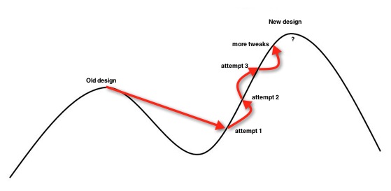
When making radical changes to your website, don’t give up too quickly. A completely new design and layout may not perform better than the old one right from the start. Especially if the old site design has been tweaked to perfection through the years. Further tweaks and optimization of the new design may be needed to actually make it convert better than the old one.
In other words, your old design may seem optimal, but it may be a local optimum. A radical change can bring you to the slope of a new higher hill. Maybe you’ll be dropped a bit further down the hill, but further tweaks and tests can lift your website to new heights. Heights you would never have achieved with the old version:
Interesting results. I’d certainly have given up after the first round…
I keep hearing both that you should repeat the CTA and also that you shouldn’t have it before you convince the customer. Clearly it is something that have to tested…
Great post, Alwin!
A few things I suggest to test:
1. Try different site-wide pictures.
2. Try to smile on the photo
3. Try to take a picture so that your eyes were directed to the call-to-action box.
You can get more ideas from this article: http://www.getelastic.com/people-in-photos/ (not mine).