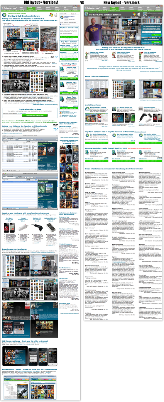
 We just started an A/B split test for a major re-design of our product pages. The goal: higher conversion rates and more profits (duh…).
We have been tweaking and testing with small changes of the old design for a long time.
But now it’s time for a major overhaul, with a cleaner layout and a more “2012 looking” design.
What’s new:
- New browser-wide dark grey header with product name, main headline, platform logos and Facebook box.
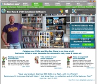
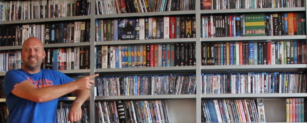
- New site-wide picture at the top, with my two main call-to-action boxes (try and buy), plus a new picture of that handsome bald guy 🙂
- 3 column content layout instead of 1 column content with narrow sidepanel.
- Site-wide testimonial in big font, linking to more testimonials at the bottom in 3 column masonry layout.
- Fancy buttons, with nice gradient and rounded edges.
- Clearer separation of included software features and optional add-ons.
- Using white space for column separation instead of borders.
Here’s the old and the new design next to each other. Which one will win?
Time will tell. I’ll probably run this test for at least 2 weeks.
Of course, the results will appear here.


The new layout looks a lot more ‘modern’ and ‘clean’.