 Here’s something from a project I have been working on off-and-on for the past few months: Rewriting the entire shopping-cart system of the Collectorz.com site.
From the shop, via the upsell interstitial page and the name/address page, to the payment details page and finally the order confirmation page. I have written some new back-end PHP classes and am now rewriting all website pages based on those classes, making the pages more consistent, and more importantly, easier to maintain. Easy maintenance is essential, because I am tweaking these pages quite often.
I have already posted about my upsell interstitial page a while ago, which was the first page I based on the new back-end classes. This long Easter weekend I have completely rewritten the first page of the check-out, the shop page.
The Collectorz.com shop
This page has always been a challenge, because it easily becomes pretty complex. We have seven downloadable products, all with a Standard and a Pro edition. For 3 products we also have Mac editions. Plus we sell subscriptions for our 3 Connect web-apps.
Then there’s the Priority Support and CD-ROM delivery options. And of course we offer two types of barcode scanners (a third one will be added soon).
In fact, this page is so complex that for our recommended Buying Choices on our product pages, we skip this shop page, taking visitors directly to our upsell page. But a full shop page that shows everything we sell is a necessary evil, so I keep trying to make it as simple as possible.
What’s New?
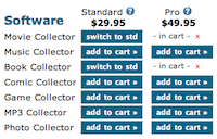
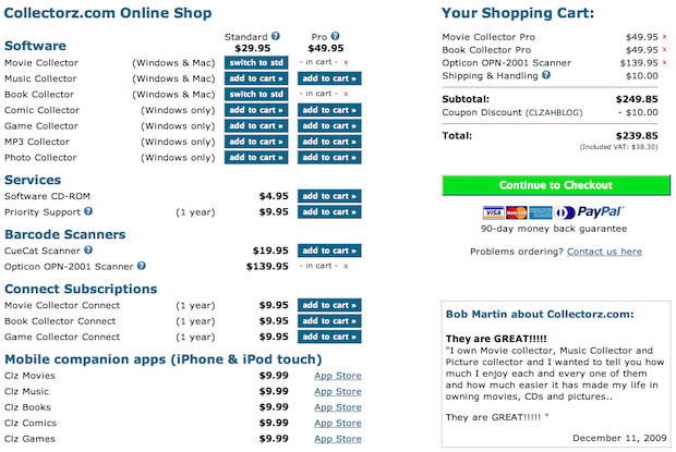
Of course the rewrite was a perfect opportunity to implement further improvements. Let me give you an overview of the changes I made compared to the old page. The best way to see how it works is to play with the live Collectorz.com shop, but here’s a screenshot for easy reference:
The changes:
- Cleaner design, using white-space for separation, not borders.
- Both Windows and Mac programs are now visible. The old page showed just Mac OR Windows editions based on the browser agent, but that caused confusion.
- Better handling of empty carts. Now shows “- your cart is empty – ” and disables the Continue to Checkout button.
- Easier switching between Standard and Pro editions. Previously one had to remove the Pro edition from the cart, then add the Standard edition.
- It’s now easier to remove items from the cart (people missed the little red X-buttons in the cart). You can now remove on the left side too.
- Added our iPhone apps, even though they cannot be purchased through our shop, just linking them to the iTunes App Store.
- Prominent random (but recent) testimonial.
- Added images of most important payment methods.
- Prominent 90-day money back guarantee
- Several question-mark icons that open small explanation popups (created with Thickbox). The old page had some “more info” links too, but these linked to other pages on the website, taking people away from the Shop page.
The new page has popups for:- Standard vs Pro
- Priority Support
- Barcode scanner comparison
- Shipping and handling (about delivery times)
- Coupon Code (with the hint: “Don’t have a coupon code? Google is your friend!” 🙂 )
What’s next?
Currently, the Shop and the subsequent Up-sell pages are consistent in look and feel. Next up is a rewrite of the other pages, the name/address page, the payment details page and the order confirmation (or “thank you” page). I am planning to make the look of all these pages fully consistent, then add some kind of “Step 2 of 5” indicator at the top, showing the buyer where he is in the check-out process.
The payment details page is going to require some creative programming (read “hacking”), because that step does not happen within our site, but on the RBS server.
Oh, before I forget, all feedback on the Shop is very very welcome.
Just post below. Thanks!


Clear and comprehensive layout and design. Quick and effective implementation.